
Gift Shop T-Shirt Design, 2020
Typography
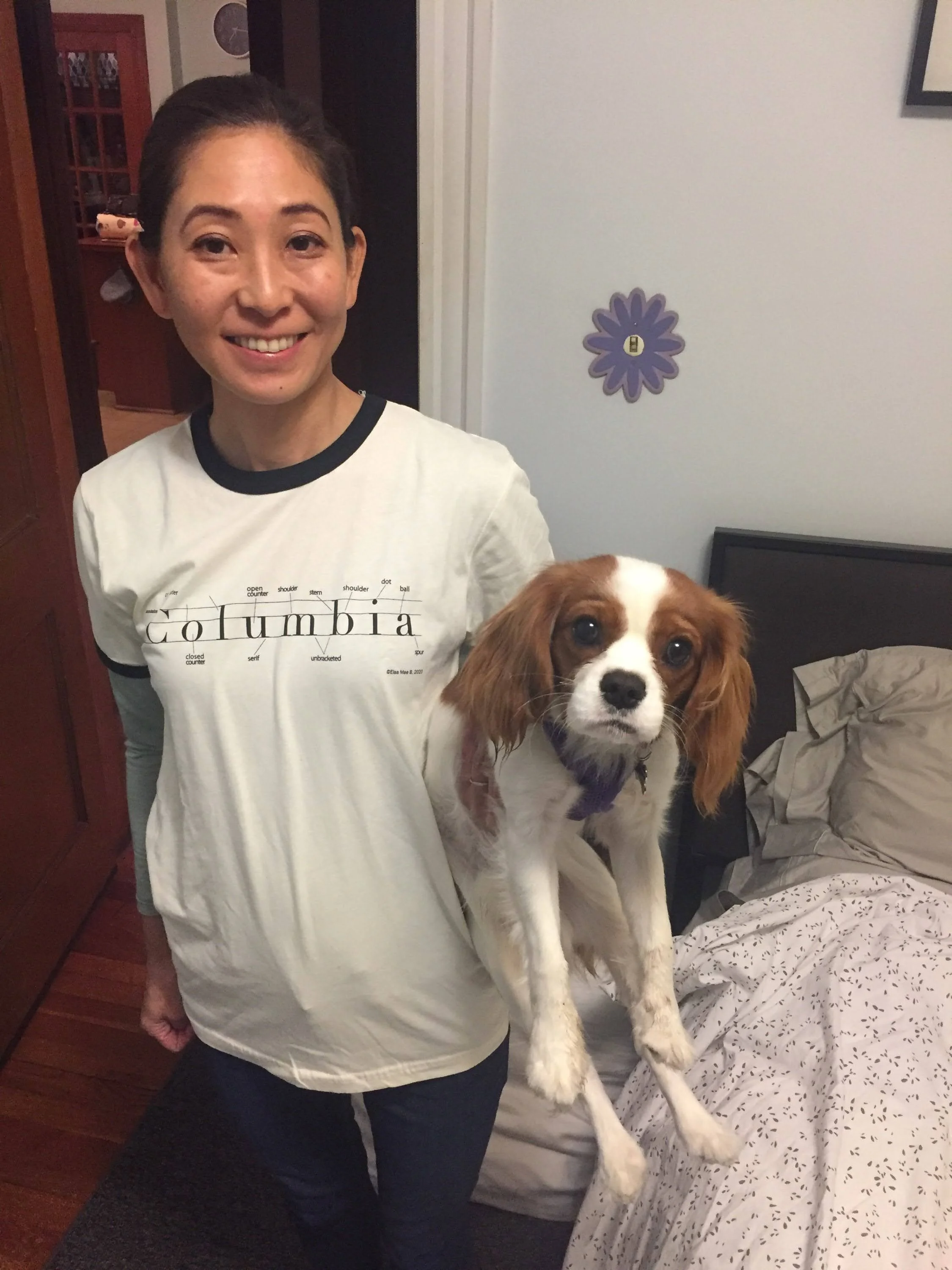
A type-enthusiast’s t-shirt for sale online and in store at ShopColumbia as a part of the Buy Columbia, By Columbia initiative to expand representation of artists.
ABOUT
Typeface anatomy describes the vocabulary of graphic elements that make up letters in a typeface.
I created this t-shirt design in my Typography class during the Spring semester of 2020 with Assistant Professor of Instruction, Sarah Faust.
ROLES
Graphic Designer
Research, ideating, iteration, typography
TOOLS
Sketching, Procreate, Adobe InDesign
TYPE
Didot and Futura
DURATION
5 weeks
TARGET AUDIENCE
Students, teachers, and graphic designers
THE PROBLEM
I wanted to come up with a t-shirt design for ShopColumbia, our school’s gift shop. I wanted the design to both represent the school’s name and show what the school does, educate in the field of art and design. It had to be simple enough for a non-design student to want to wear, but niche enough for a typographer to get excited about.
THE SOLUTION
By showing the type anatomy in an almost scientific way, the design gives the customer a glimpse into the world of typography. I used Didot and Futura for the primary and secondary type and left the color palette simple with black lettering.
PROCESS WORK
As seen below, I went through an exploratorive process that involved trying out different words. Getting deep into the research of type anatomy allowed me to see how type anatomy is broken down for any part of any letter.
The t-shirt on display in ShopColumbia’s window front.


T-SHIRTS SPOTTED IN THE WILD!
To learn in a fun way has always been a passion of mine, so to have a t-shirt that shares the terminology of type with others has been fantastic to see!


BONUS WORK: DIDOT BAG
THE BAG THAT’S YOUR T Y P E

OK Didot: Type Anatomy Gif, a play on words.
In Addition to this main design for Columbia, I created another design that incorporated illustration into the work. A play on words, this design shows the word OK with its type anatomy, and personafies it in a literal sense. The “leg
and “foot” of the K became this letters foot for a powder blue kitten heel.
I created this illustration by making and uploading the letters OK onto my iPad and drew over it using Procreate. This two-layered design works well on merchandise that show a front and back. For instance, the front of a bag could show the illustration, and the reverse side of the bag could show it’s anatomy.


Front of bag

Back of bag